On the Border
Solving for a Common Goal
The immigrant respite center in McAllen, TX was housing more people than it could manage during the summer of 2018. A community center room was divided into different operational sections. Just inside the entrance, volunteers sat at long tables, processing incoming crowds and checking their paperwork. In a corner was a crowd of people still having issues with their paperwork. Another series of long tables across the room was staffed by more volunteers serving food and water to these travelers who had been trekking, potentially on foot, for who knows how long. Adjacent to that, a wide-screen TV played cartoons in English, in an attempt to comfort and calm the children sitting on the floor.
Throughout the room, pro bono attorneys shouting over the chaos to pockets of gathered adults. They repeated the same information for hours, explaininging the paperwork border patrol had given the immigrants and describing what was going to happen next.
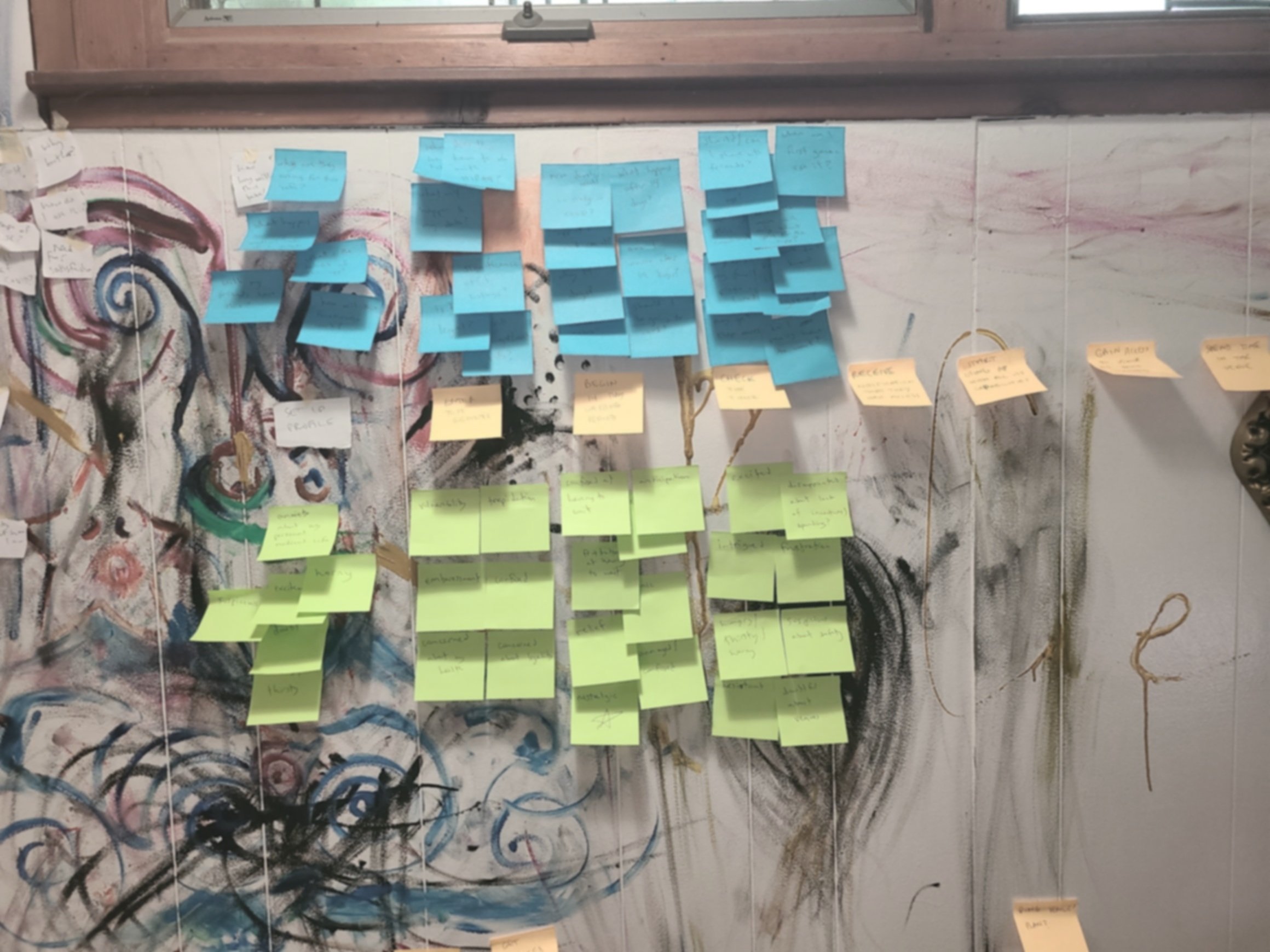
After hearing this a volunteer attorney’s description and seeing seeing the photos above, I interviewed her about her experiences in the center. Based on her account, I created a series of journey maps to try to understand the experiences of people in this particular center.
By studying the journeys of attorneys, immigrants, volunteers, and border patrol officers, a few impediments became clear. Not only was there often a verbal language barrier, the legal paperwork given to the immigrants was also in English. And, of course, the chaotic environment of the center was detrimental to effective communication.

However, I also noticed a common objective of all concerned parties - newly arriving immigrants needed to correctly enter the legal asylum process. So I aimed for that same goal.
The verbal and written language barrier, along with the attorneys' difficulty reaching their audience were all clear problems. Additionally, the vital details the immigrants needed to begin the asylum process were provided in a dense packet of other documents written in English. In general, they were being inundated with an overwhelming volume of information, none of which was clearly prioritized or given any level of relative significance.
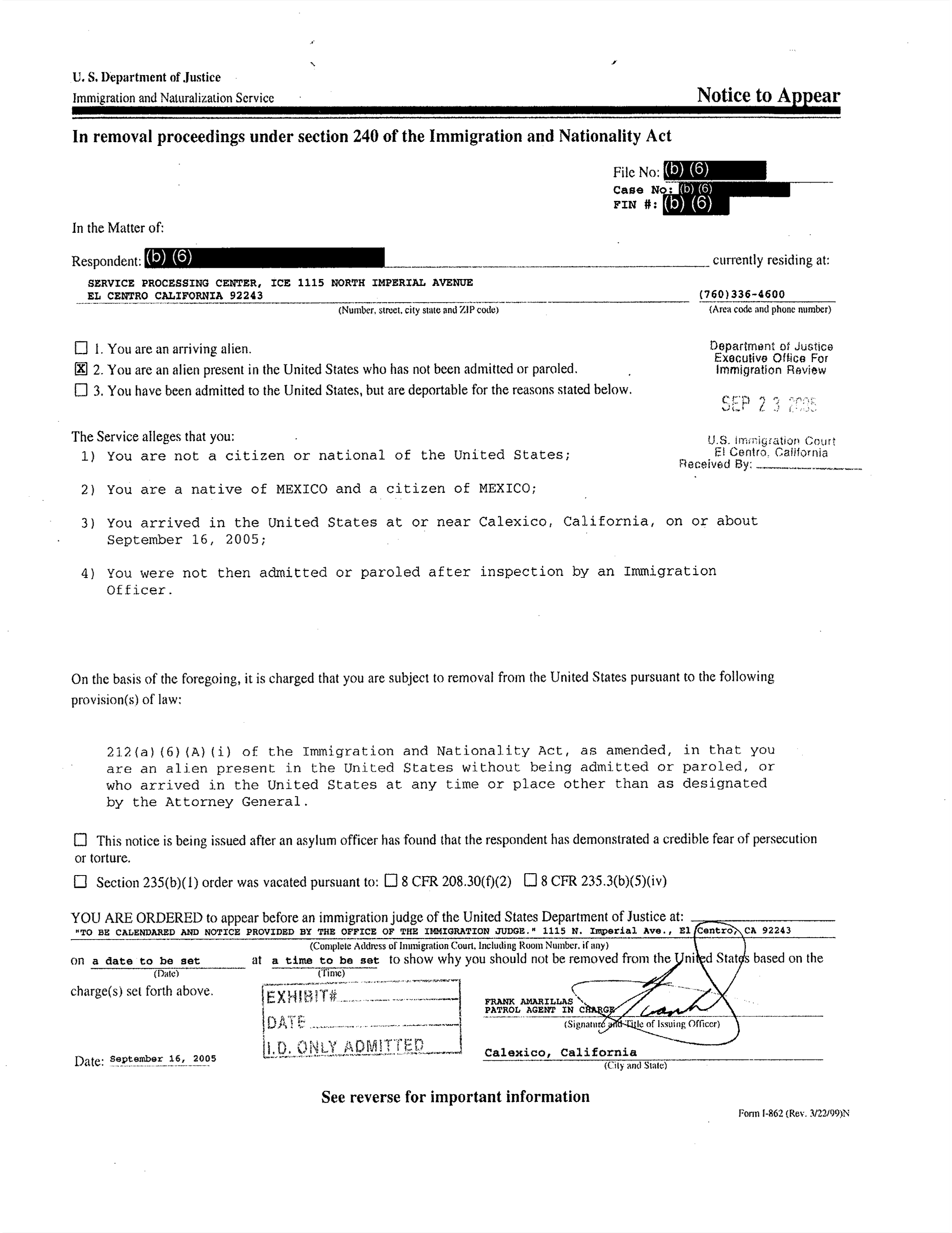
Notice to Appear
This document includes the individual’s ID number along with the date, time & address for their first scheduled court date.
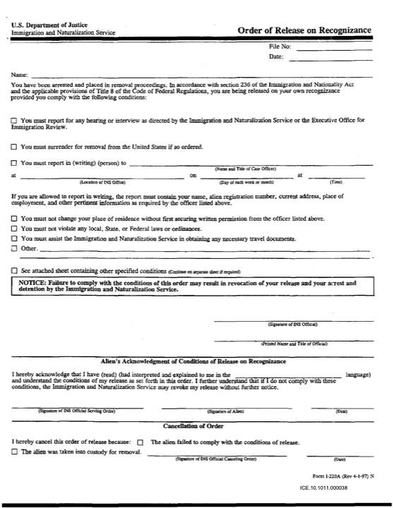
Order of Release
This document provides details around the individual’s status, rights & limitations going forward. It also provides an additional date, time & address for their first meeting with an immigration officer. Like the other form, it’s in English legal jargon.
My attorney colleague and I were able to identify the 2 forms above as being most important in asylum-seekers’ legal path forward. She pointed out 3 key items on the documents that were most essential:
their ID number
the date, time & location of a mandatory court hearing
the date, time & location of a meeting with ICE
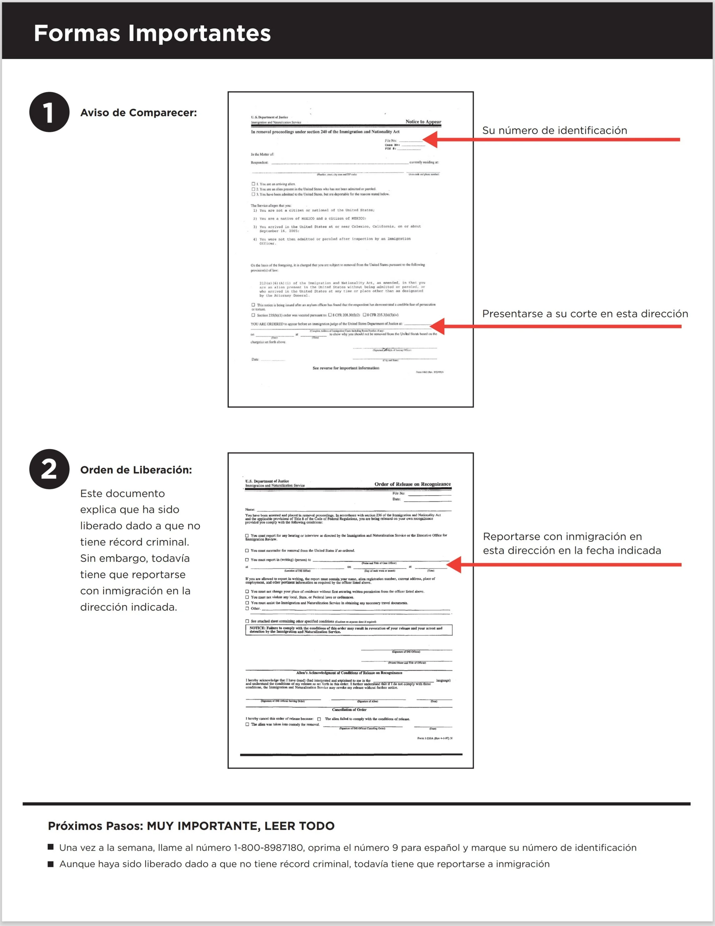
It seemed a visual aid to help users identify the pertinent forms and to break a language barrier was a solution. It would need to be a large poster, visible to much of the room, or a flyer to be mass produced and handed out by the volunteers. If both were printed, the posters could serve to emphasize the flyer’s significance.
I created a low fidelity design displaying the 2 important documents and emphasizing the 3 essential pieces of information. My attorney colleague translated a more empathetic summary of content on the Order of Release - This document explains that you’ve been freed because you don’t have a criminal record, but you still have to report of immigration officers as directed. At the bottom, I included a phone number for case information and gave a more cautionary version of the Order of Release summary - Even though you’ve been released because you don’t have a criminal record, you still have to report to immigration officers. Last, a colleague in visual design polished my wireframe.
Going Further
Looking back, there are a number of improvements I would make to this work.
It’s confusing that there are 2 sets of date, time & address. If I were able to work with this again - and I hope to - I would emphasize that there are indeed 2 appointments set for the individual and that the forms are not redundant of one another. I would also outline some details around what to expect at each of these appointments.
These forms are still buried in a stack of other papers. We relied on individuals’ ability to identify visual ‘landmarks’ on the forms we displayed. The idea was that the images on our poster/flyer could be matched to pages in immigration packets. That seemed to be all we had to work with, but it isn’t ideal. This effort began as an exercise in Service Design, and I would like to have coordinated with the volunteer task force to have the crucial forms explicitly marked so they would stand out.
We only shared our work with this one center. With greater effort and a larger team, our product could have helped exponentially more people. By looking for ways to provide the poster/flyer to other similar centers, we could have improved the experiences of a much wider group.
I collaborated directly with only volunteers and attorneys. The most valuble aspect of this project and what I’m most proud of, is that it addresses an issue that seemingly opposed parties (immigrants and border patrol) would agree is a problem. By also coordinating with border patrol and illustrating the benefit to their mission, we might have received buy-in from them and won allies of a whole different nature.
We were unable to validate our journeys. The situation we were approaching is so gravely serious, I didn’t attempt to refine my journey map. On one side, immigrants and volunteers have far more pressing matters to deal with than Design Thinking exercises - on the other, without border patrol’s partnership, I lacked access to any resource to consult. Again, with planning and a larger team, we could take steps to establish a lasting initiative aimed at enhancing this product and expanding to other project concepts.


